5 examples of web design done right | The Giles Agency
by The Giles Agency


Web design is an essential part of how your brand performs, and how it is perceived by potential customers and collaborators. For inspiration in your journey to conquer the web, we’ve rounded up a handful of sites that get it right.
Zillow
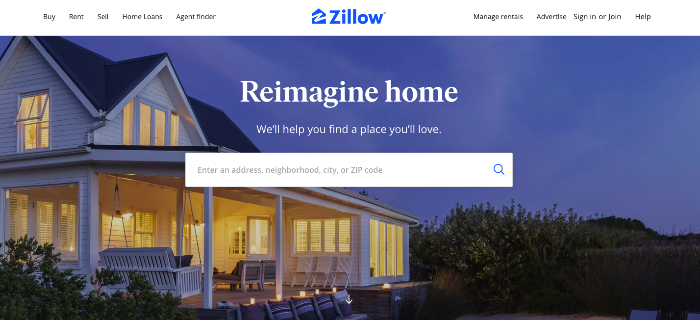
Property website Zillow immediately taps into exactly what a site visitor wants: to search for available properties. The homepage design is clean, largely copy-free, and delivers all the information needed of a landing page. Visitors can search for properties to buy, properties to rent, sign up to sell their property, manage or advertise their rental properties, or seek home loans or agents – all from one sleek, eye-catching page.
Toggl
Bright, fun, quirky, with concise, effective copy – Toggl hits all the right notes with its site, which extolls the benefits of its time-tracking tool: a simple, powerful way to improve productivity. As seen with Zillow’s site, Toggl opts for a clean homepage with a single call-to-action and lots of negative space. This goes to show that space is sometimes most appealing and effective left unfilled.
ThredUp
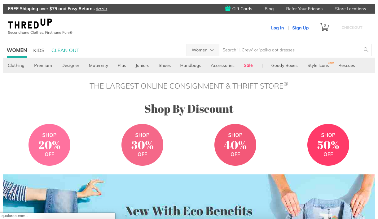
Copy-free and sleek sounds good, but what if you simply have a lot of content to promote? ThredUp navigates this hurdle deftly by highlighting a rotating range of articles, departments, and special offers on their homepage. While there’s a lot to see, it’s all arranged in a readable, logical way, with links that direct visitors to areas likely to be of particular interest at a given moment (e.g. a sale or seasonal/cultural trend such as eco-friendly products).
Skype
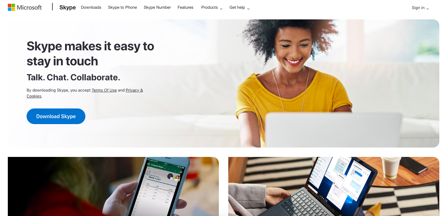
Skype utilises an elevator pitch approach to its strap-line. It summarises exactly what the product does, the benefits it offers, and how you can download it – now. As attention spans shorten and patience levels decline, this is an ideal approach for web. Although the medium offers almost unlimited space for copy and content, restraint is just as important online as it is on paper. The photos are appealing and tie in with the brand’s core messaging, and the grid format works well onscreen.
Basecamp
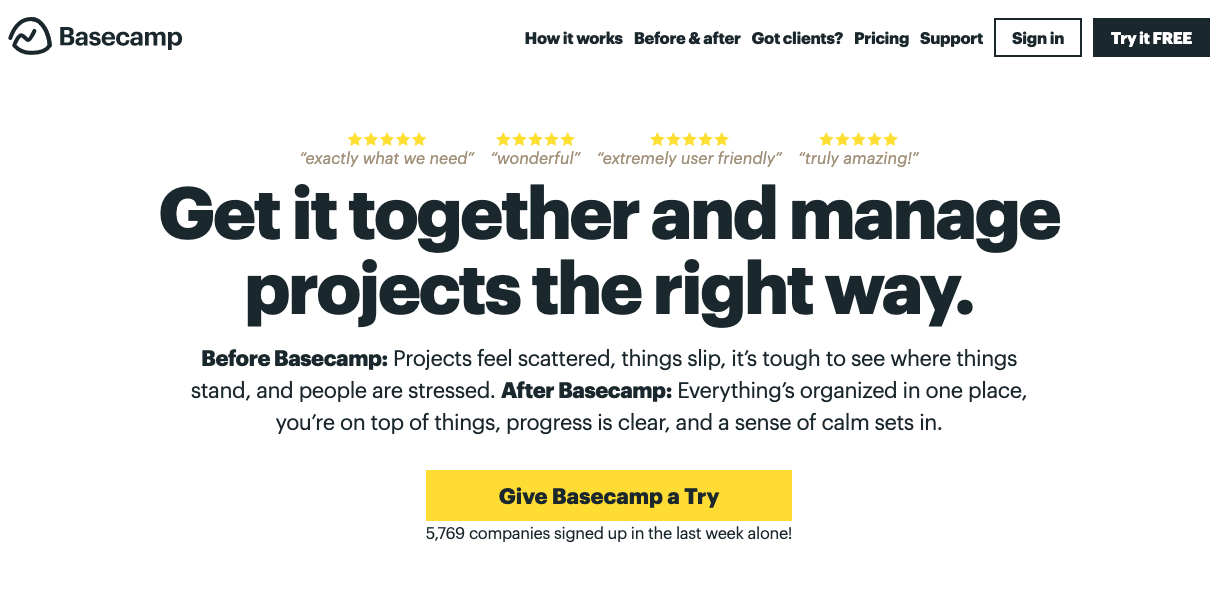
Basecamp is an example of a site that effectively works client feedback – in the form of testimonials and sign-up figures – into their design. The numerous stars catch the eye and leave an impression of positivity and renown, and the large headline font complements, rather than fights against, the bright call-to-action button below. By utilising a limited colour palette and relying on font size as a main distinguisher between site elements, Basecamp effectively keep their visitors’ attention and give an overall impression of effectiveness, proficiency, and value.
Need help?
If you’re looking to change up the design of your website, contact us on enquiries.hk@gilesagency.com to see how we can help you achieve your goals.